Assignment 3
Critique 1
I have chosen video game as the theme of the infographic as I would want more people to know about how big the industry it is.
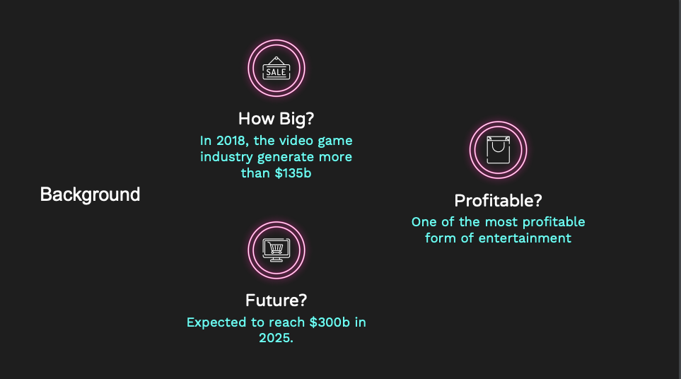
Firstly, I introduced how the video game industry is like. I managed to find data on the revenue made per year by the video game industry and it is one of the most profitable form of entertainment right now.
However, I think I misunderstood the purpose of infographic as I thought it can be an marketing note to potential investors. Therefore, I have the objectives in place here.
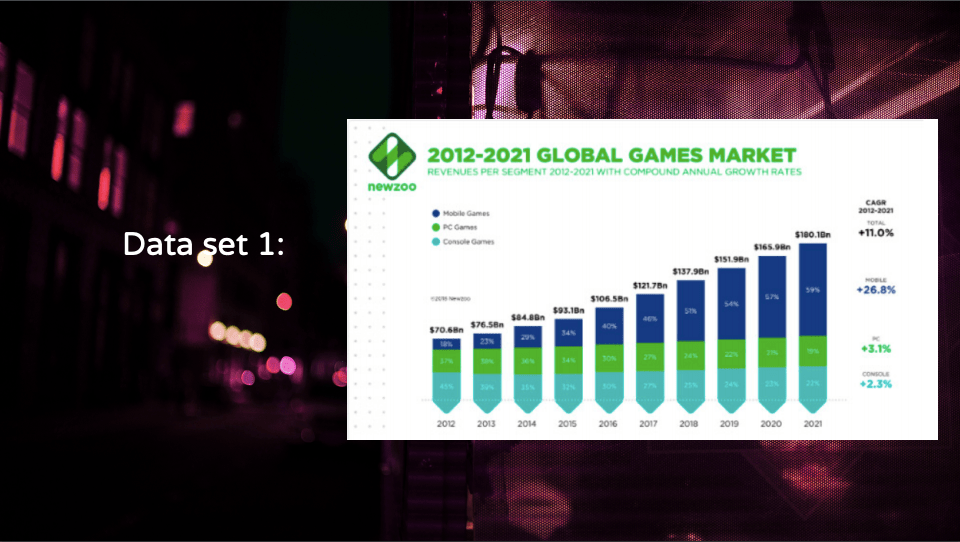
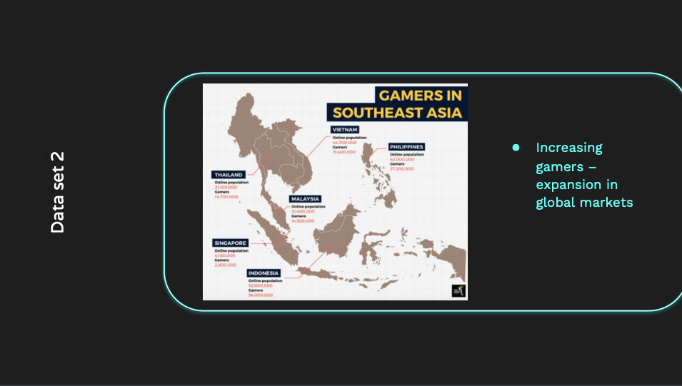
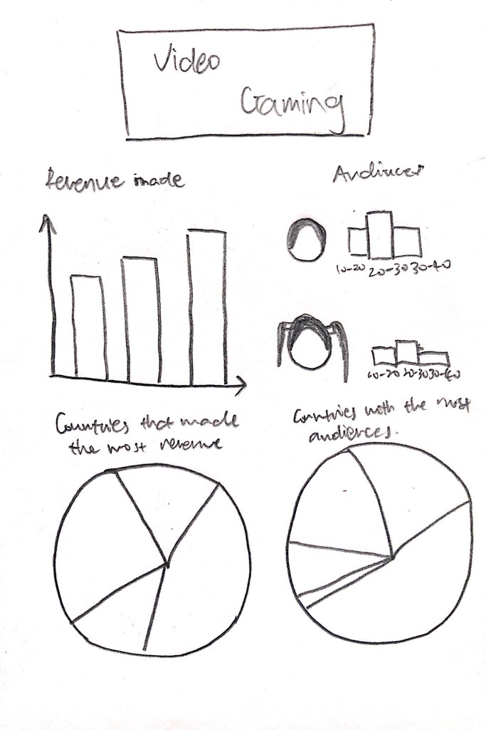
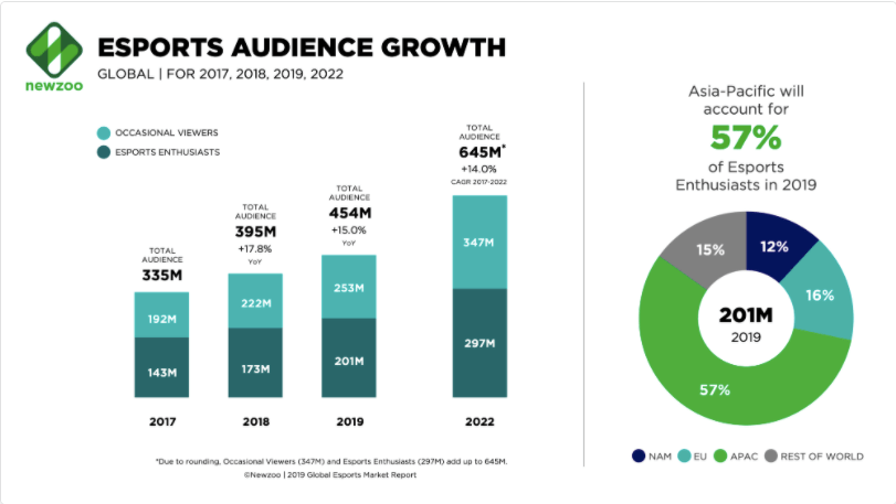
These are some of the data that I find during critique 1. At the end of the critique session, I decided to change my topic and narrow down to one aspect of video game. Additionally, I was told that the focus of the infographic is to convey information effectively, but not to convey someone to invest in an industry. Additionally, I want to add more characters in my infographic in order to catch the attention of the audiences.
Critique 2
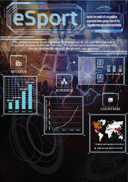
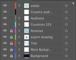
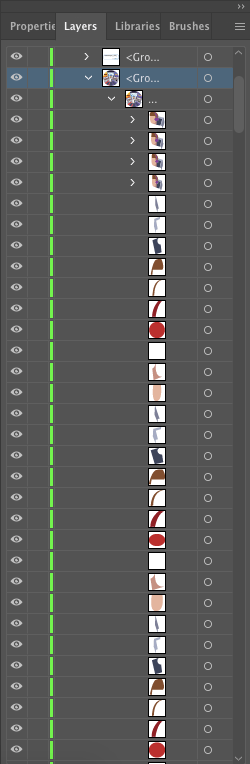
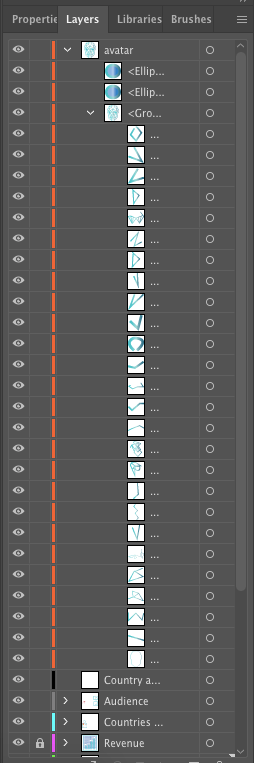
Here is a half done infographic. And below are some of the layers. I did not include everything as it is too long.
Audience: Anyone that is interested in esport; teenagers aged 18-25.
An introduction to one of the biggest form of entertainment, esport and how big the industry is.
Choice of typeface: Brevier and Source Serif Variable
Choice of colour palette: Going for scientific Neon colours. Most of the colours I have chosen are from 1) Pantone + Pastels & Neons Coated and 2) Gradients – Gem and Jewels
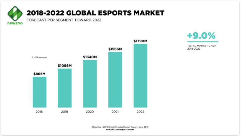
My main goal is to inform about esport. Thus many of the data that I used is based on the whole industry. For the revenue data, it was based on the following:
To present a digitalised world, I made use of neon lines to create an illusion of pop-up screen.
For the audience segment, I decided to use an avatar to show that difference in gender group and age group.
Feedback:
- Organisation of information can be improved
- Flow of information between countries and audiences very weird
- Some of the information are overwhelming; need to spread out
- No use of image in the background
- Colour and Font of text hard to read
- Cut down on wordiness and reconsider typography choices
Final
For the Final assignment, some changes has been made.
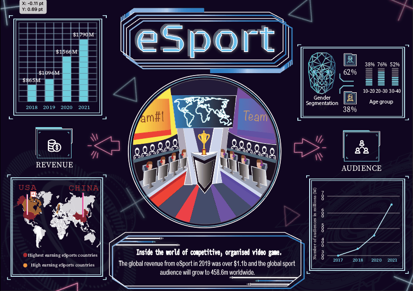
- For the organisation of information, I decided to separate into two components. On the left, I will talk about the revenue made in the esport industry, while on the right I will talk about the audiences. For the revenue component, I use the stats that I have found can created a bar chart to show the comparison of revenue made per year in the industry. From the chart, we can observe how esport is a billion dollar industry. Additionally, I would also like to show which countries are making the most revenue from esport. On the right, I show the demographic of players who are playing online and number of audiences who viewed sport each year.
- The flow of information is much more clearer in this sense as viewers can see two flows of information only.
- At the bottom of the infographic, I cut down on the information and change the font to make it easier for the viewers to read.
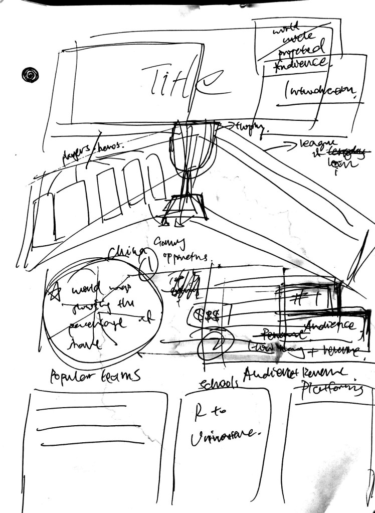
- One problem that I find was changing the background of the infographic. I really wanted to show the live scene of esport but I cannot use online pictures as background. In the end, I decided to draw the live scene instead. It was fun using illustrator to draw out the designs that I wanted and was glad that the final design looks good.
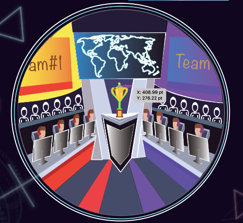
Overall, no major changes has been made for final design except for the drawing. The drawing is important for this infographic as it is the focal point. It captures the attention of the viewers and they will be curious about the drawing. Then they will take time to read the infographic.
Problems that I encounter:
1)I wanted the background to be black in colour thus I change the document setup to match the black colour. However, when I tried to save the pdf, it turns white. In the end, I drew a black rectangle as the background.
2) It was hard to draw on using trackpad as it is really hard to control the pen tool.
 Journey of 3two1seven