Thursday, September 19, 2019
In-Lecture Exercise E
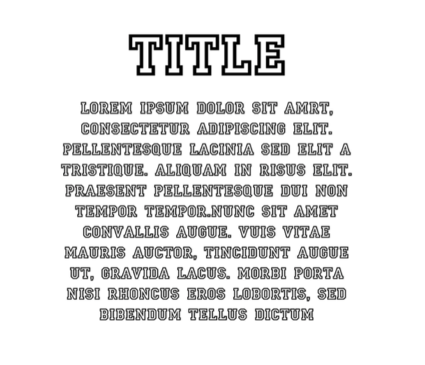
What seems to be off?
Firstly, the body is not legible unlike the title. For the title, it is easy to read due to the lending in between the alphabets and the bold character. The body’s typography makes it hard to the reader to distinguish because of the empty white space in the letter. As the white background blends with the alphabet, the thin outlines are not distinct for the readers to read. Secondly, the serif type makes the alphabet looks like they are connected therefore hard to read.
Improvement
Firstly, I will will change to alphabet type to San Serif as it’s better for legibility. Secondly, I will increase the lending in between alphabets.

