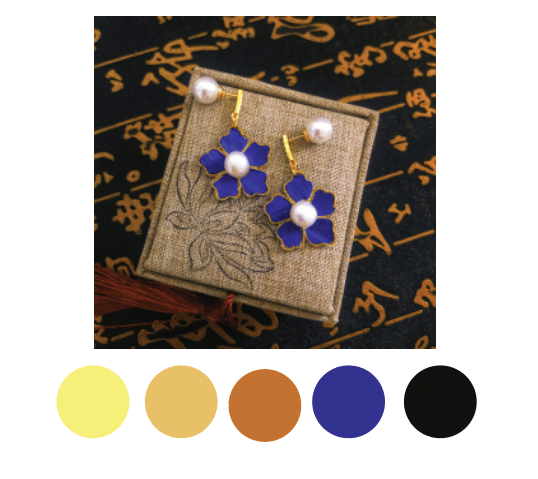
For this colour palette, it gives off a luxury feeling. I used a mixture of warm and cool colours to give an impression of grand yet elegant feeling. The different chroma of yellow is to emphasis on the gold materials used in the design. The blue colour is the surprise focal point in this image. The blue feathers stands out from this colour palette as it is the only hue apart from black. According to the complementary colour scheme, blue and yellow are opposite each colour on colour wheel. The high contrast creates a vibrant look, which can attracts the customers’ interest and focus on the blue feathers. The analogous colour scheme that I used in this colour scheme is yellow, orange and brown. These colours are next to each other on colour wheel which creates a harmonious feeling to the overall image. It also balance out the high contrast such that the look is less ‘fancy’ or creates less stress to the viewers.
 Journey of 3two1seven