Group project

Before we split our roles, each of us draw our own designs.
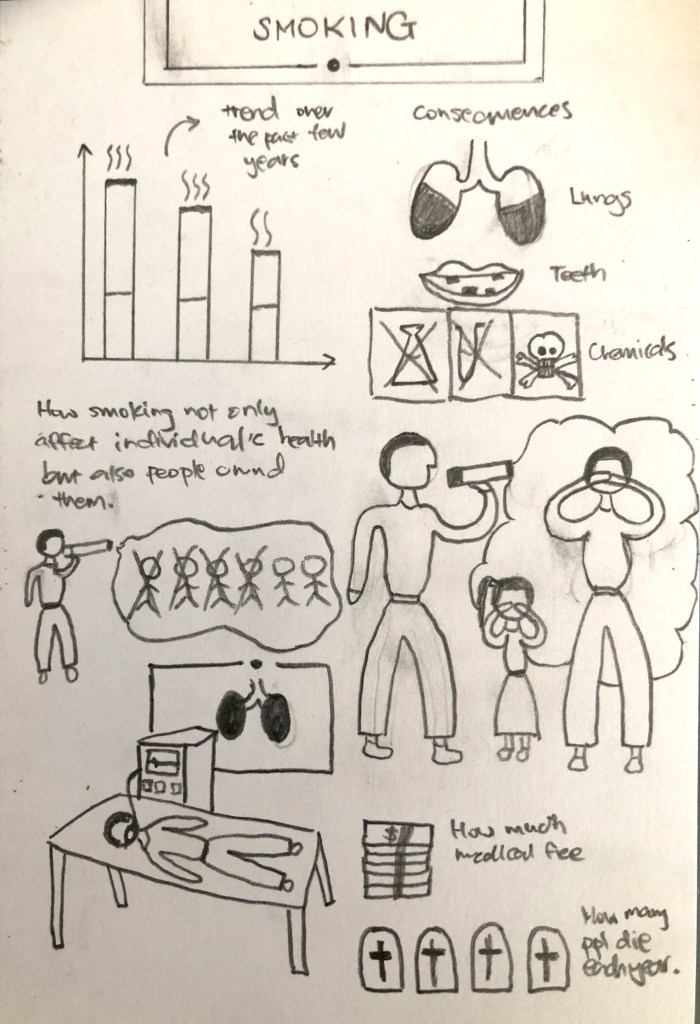
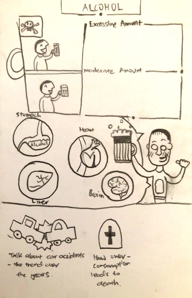
I was going for more cute doodles as it helps to attract the attention of the views. After the critique, our group found that substance abuse is not relevant and decide to cut it.

We split up our roles so that we can work more efficiently and the work design is more consistent. I was in charge of the characters and elements for the group project.

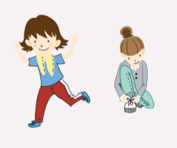
For the characters, we had a hard time finalising as the design team had different style in drawing. In the end, we decided to follow a similar guideline and follow throughout our design. Here are the designs:


Last page
Running
Exercise

These are some of the character design that was designed are not chosen as the style is different and colours do not match. Many of the characters that I have designed are three dimensional. At first, we had decided to create the last page using sunset to illustrate the end of a journey. However, the tone and drawings does not match the overall ebook. Hence, we did not use them.
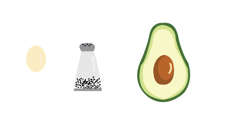
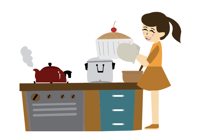
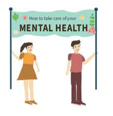
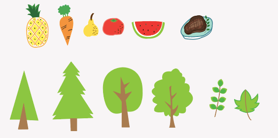
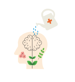
These are some of the designs that I did. For the characters, I will follow the guidelines made by other group-mates and amend if there’s any errors. Since we are trying to appeal to millenniums who have shorter attention span, we have decided to create more pictures to illustrate some of the activities and ideas. Before using illustrator to draw out the designs, I will do sketches on a piece of paper. I have always been interested in doodling therefore it was easy for me to come up with simple cute illustrations. However, for some of the illustrations, I do have difficulties such as the kitchen and mental health banner. I need to make sure that the style is consistent throughout the design.

For the design document, I was in charge of production. After looking through my own part, I looked through the whole document and add comments and work. Our group meet up once a week to go through the document to make sure of the progress.
In Lecture Exercise F

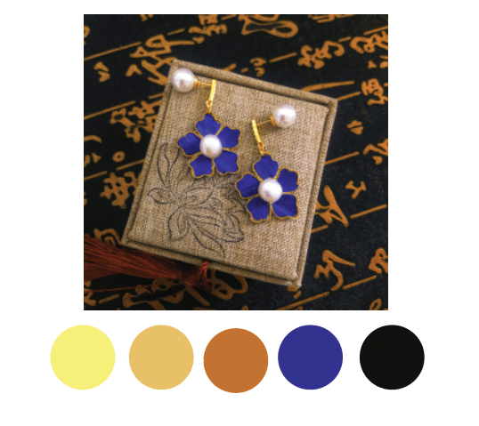
For this colour palette, it gives off a luxury feeling. I used a mixture of warm and cool colours to give an impression of grand yet elegant feeling. The different chroma of yellow is to emphasis on the gold materials used in the design. The blue colour is the surprise focal point in this image. The blue feathers stands out from this colour palette as it is the only hue apart from black. According to the complementary colour scheme, blue and yellow are opposite each colour on colour wheel. The high contrast creates a vibrant look, which can attracts the customers’ interest and focus on the blue feathers. The analogous colour scheme that I used in this colour scheme is yellow, orange and brown. These colours are next to each other on colour wheel which creates a harmonious feeling to the overall image. It also balance out the high contrast such that the look is less ‘fancy’ or creates less stress to the viewers.

In Lecture Exercise E

Thursday, September 19, 2019

In-Lecture Exercise E

What seems to be off?

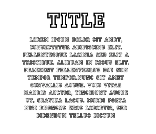
Firstly, the body is not legible unlike the title. For the title, it is easy to read due to the lending in between the alphabets and the bold character. The body’s typography makes it hard to the reader to distinguish because of the empty white space in the letter. As the white background blends with the alphabet, the thin outlines are not distinct for the readers to read. Secondly, the serif type makes the alphabet looks like they are connected therefore hard to read.

Improvement

Firstly, I will will change to alphabet type to San Serif as it’s better for legibility. Secondly, I will increase the lending in between alphabets.

In Lecture Exercise D

  • Use your phone camera, choose a subject and compose it in various shot sizes and camera angles, while demonstrating your understanding of visual composition.
  • Take about 4-6 images.
  •  State the purposes of using these techniques and how does it affect your audience who perceive your subject.
Image 1

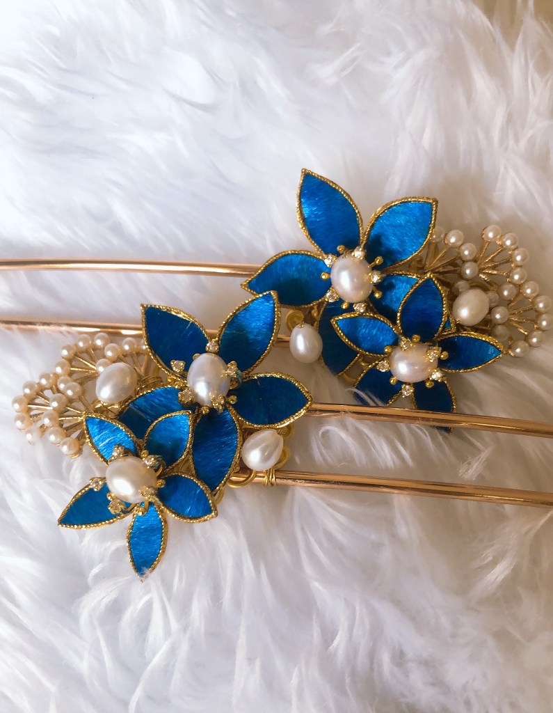
For image 1 and 4, I use the rule of third of the cardinal photographic rules of composition. Both images are taken in a horizontal orientation. However, I prefer image 1 as the focus is mainly on the flower. Additionally, the close up shot allows the audiences to see the overall design.

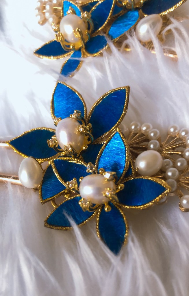
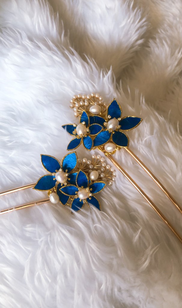
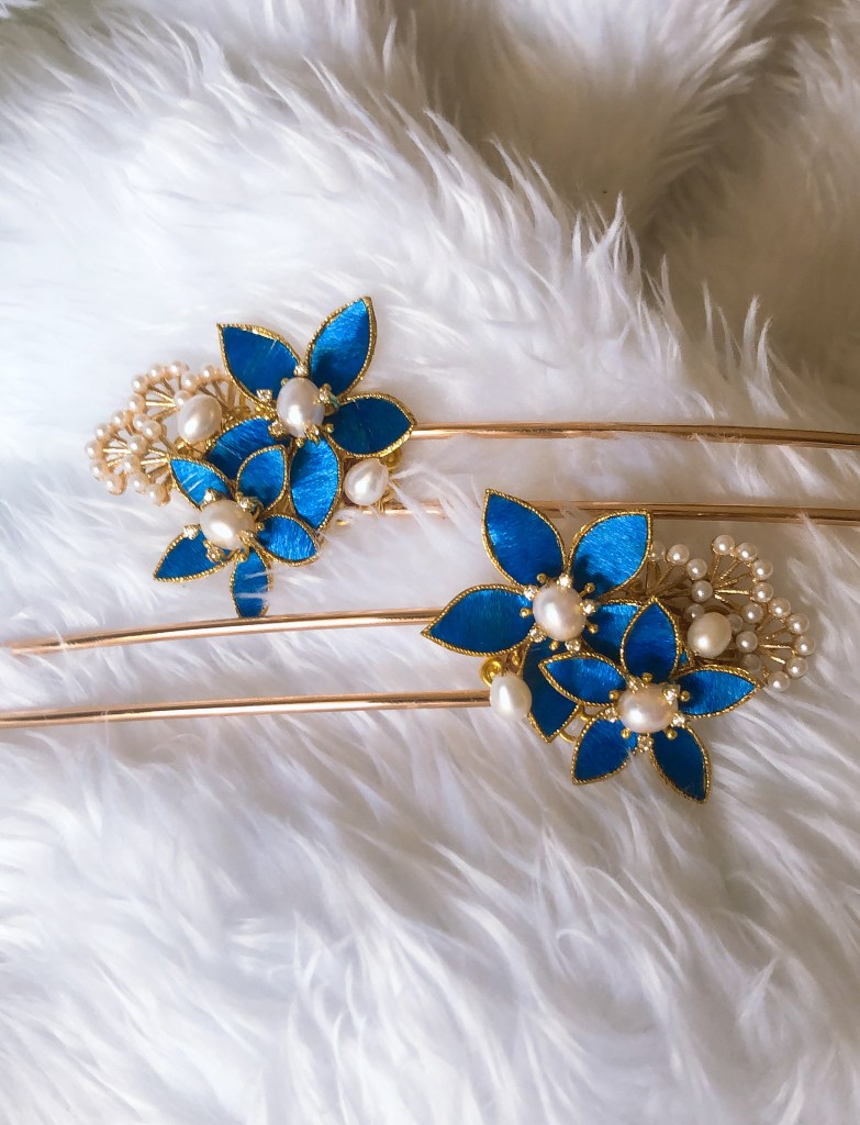
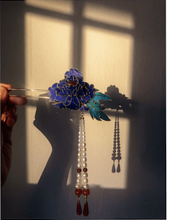
For image 2, I use the golden ratio such that there is one focal point. It is a design principle based on the ratio of 1 to 1.618. Hailed as ‘the perfect number’, the Golden Ratio can assist in creating images that have a strong composition, which will attract viewers. In this picture, the main focal point is the freshwater pearl, where I am trying to convey the customers the quality of the pearl. Overall, the image looks balanced and harmonised. Additionally, I did an extreme close up shot to show the details of the feathers and the flower.

For image 3, I think I used rule of third and take the picture at an eye level. This helps to give the customers a realistic proportion of the design so that when they are not alarmed about the size difference when they received it.

In-Lecture Exercise C

Signifier

  • Red background
  • Sliced tomatoes forming a classic Heinz Ketchup bottle
  • Slogan – No one grows Ketchup like Heinz

Signified

Heinz’ Ketchup is made using real, fresh tomatoes that are freshly grown with no synthetic flavouring and preservatives.


Analysis

The use of fresh tomatoes to form the shape of a Heinz Ketchup bottle signifies freshness and implies that Heinz uses fresh tomatoes instead of artificial flavouring and additives to make their ketchup.

Lastly, the caption states “No one grows Ketchup like Heinz” and while it ketchup is not by means “grown” but made in a factory, the creator of the advertisement is trying to redefine the ingredients of ketchup and to convey that Heinz Ketchup are as fresh as tomatoes grown in farms. As compared to factory made sauce, the advertiser is trying to promote a ‘healthy’ image to the audience.

Assignment 2

The purpose of the storyboard is to tell with the audiences about a story. The storyboard that I am doing is trying to tell a jewellery brand story.

In this storyboard, I’m aiming for oriental feeling which helps to bring the audiences into the story. I decided to tune the colours to more old school so as to bring out the traditional sentiment. There are two main objectives that I would like to convey to the audiences. Firstly, I would like to tell the relationship between the jewellery maker and the client. Secondly, I would like to tell the importance of customisable and handmade jewellery pieces.

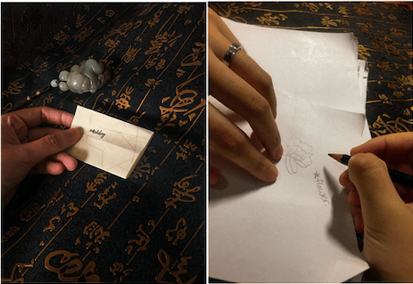
In the first picture, I received a wedding order from my client. In reality, the client texted me instead of writing a letter. However, I changed the setting such that the client wrote to me, showing the importance of the wedding. For the background, I decided to place a black table cloth to make the setting more grand.

In picture 2, the client and I meet up and discuss about the design of her hair ornament. In the meeting, I prepare a list of questions for her to get a better understanding of her. However, it is hard to show in the picture and therefore the main emphasis will be on the meeting instead.

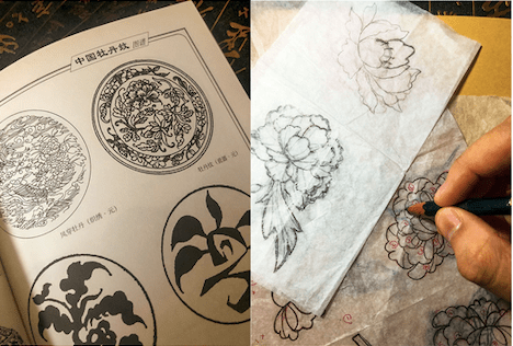
In picture 3, I started to look for creative idea so that I can design her hair ornament. In the process of designing, I tried to search for symbolism in the design. In Chinese, peony symbolises happy marriage, good fortune and honor. Thus, I decided to use this flower as the overall theme for the design.

In picture 4, I began drawing designs for the hair ornaments. However, it was difficult to show in the communication process with the customer as I sent her the designs and asked her which one she like. It was hard to show the uniqueness and originality of the design in the storyboard.

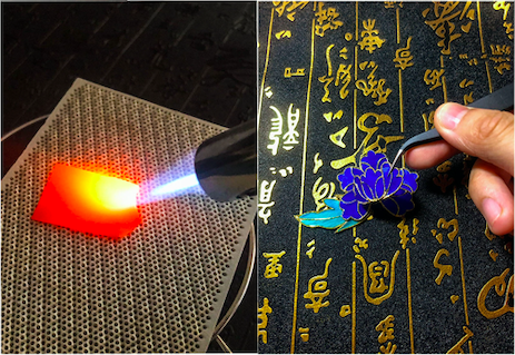
Picture 5 and 6 show the process of making and assembling the hair ornament. The idea that I want the audience to get is that handmade jewellery take lots of effort as the creator puts in their best effort in making.

In the last picture, the design is done.

Assignment 1

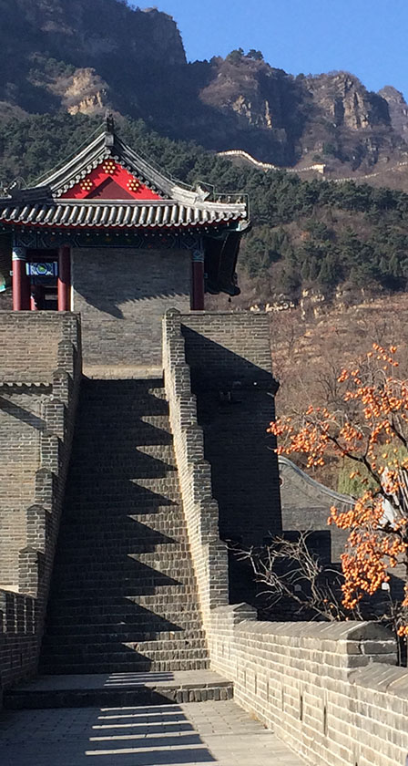
For Assignment 1, I have chosen a picture when I went to the Great Wall of China. The signs in the image included stone stairs, a Chinese pavilion, mountains and tree branches. All these signs create an oriental environment and symbolise the Chinese culture.

According to the Week 4 Lecture notes (2020), the process of abstraction is one of distillation, the reduction of multiple visual factors to only the essential and most typical features of what is being represented. Therefore, in the process of abstraction, I decided to keep the two important signs: the stone stairs and pavilion, as the main focal point of this assignment.

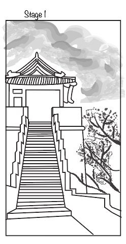
For this assignment, I choose to use illustrator. At stage 1, I use the pen tool to trace out the outlines of the pavilion and stairs. Additionally, I use the paintbrush tool to draw out the mountain and trees. The reason why I did not trace out the mountain and trees as normal lines do not show the texture of the sign. When I think of a mountain, I think of trees and rocks. The brush shows the uneven texture of a mountain, especially in a 2D art-board. At some parts, the brush strokes may be darker, indicating that there are more trees. Lighter brush strokes indicate lesser trees. Similarly, for the trees. I choose to use a dark think brush tool to draw the branches. I also used a brush tool to create the illustration of the yellow leaves.

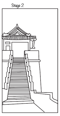
At stage 2, I take out the mountain and trees as these signs are not my focal point. Not many changes were done in this stage.

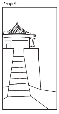
At stage 3, I decided to abstract the stairs by decreasing the number of steps and changing the straight black lines to brush strokes. From stage 2 to stage 3, the main change is that the stairs turn from a 3-dimensional sign to a 2-dimensional sign. The stairs now look ‘flat’ as compared to stage 2. Additionally, I remove extra detailing of the pavilion so that the sign could be abstracted more easily in stage 4.

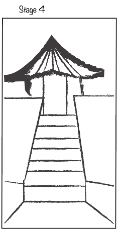
At stage 4, the pavilion sign is furthermore abstracted. I use the paintbrush tool to draw the outline of the pavilion. The pavilion has now turn into a 2-dimensional sign. I have also centred the stairs and pavilion using the rule of thirds. In lecture 5, the Rule of Thirds offers a pleasing and balanced arrangement in both horizontal and vertical orientation. In my case, the signs are centred horizontally since the emphasis is on the pavilion and the stairs.

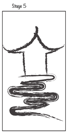
At stage 5, more abstraction was done. The overall image was created using the paintbrush tool. The details of the pavilion architect were removed, leaving the outlines behind. The stairs were replaced by the oriental cloud, also known as the prosperity cloud. There are two reasons for choosing the cloud. Firstly, the drawing symbolizes Chinse calligraphy. In the process of abstraction, I do not want to the oriental feeling to the image, that is unique and exclusive to the Chinese architect. Chinese calligraphy is an important element in Chinese culture, and it is easy to identify. By replacing with the cloud, the abstraction does not lose its focus and tone. Secondly, the prosperity cloud symbolized the sky, which means that one must go up in order to reach the pavilion. There are many layers within the clouds, which means one must climb the layers in order to reach the pavilion.

In conclusion, the main focal point is on the pavilion as it is a unique sign to the Chinese culture. However, I do not want to eliminate the stairs element as it is a unique point to the image chosen. The final abstraction wants to convey the traditional Chinese culture to the audiences.

Assignment 1

For Assignment 1, I have chosen a picture when I went to the Great Wall of China. The signs in the image included stone stairs, a Chinese pavilion, mountains and tree branches. All these signs create an oriental environment and symbolise the Chinese culture.

According to the Week 4 Lecture notes (2020), the process of abstraction is one of distillation, the reduction of multiple visual factors to only the essential and most typical features of what is being represented. Therefore, in the process of abstraction, I decided to keep the two important signs: the stone stairs and pavilion, as the main focal point of this assignment.

For this assignment, I choose to use illustrator. At stage 1, I use the pen tool to trace out the outlines of the pavilion and stairs. Additionally, I use the paintbrush tool to draw out the mountain and trees. The reason why I did not trace out the mountain and trees as normal lines do not show the texture of the sign. When I think of a mountain, I think of trees and rocks. The brush shows the uneven texture of a mountain, especially in a 2D art-board. At some parts, the brush strokes may be darker, indicating that there are more trees. Lighter brush strokes indicate lesser trees. Similarly, for the trees. I choose to use a dark think brush tool to draw the branches. I also used a brush tool to create the illustration of the yellow leaves.

At stage 2, I take out the mountain and trees as these signs are not my focal point. Not many changes were done in this stage.

At stage 3, I decided to abstract the stairs by decreasing the number of steps and changing the straight black lines to brush strokes. From stage 2 to stage 3, the main change is that the stairs turn from a 3-dimensional sign to a 2-dimensional sign. The stairs now look ‘flat’ as compared to stage 2. Additionally, I remove extra detailing of the pavilion so that the sign could be abstracted more easily in stage 4.

At stage 4, the pavilion sign is furthermore abstracted. I use the paintbrush tool to draw the outline of the pavilion. The pavilion has now turn into a 2-dimensional sign. I have also centred the stairs and pavilion using the rule of thirds. In lecture 5, the Rule of Thirds offers a pleasing and balanced arrangement in both horizontal and vertical orientation. In my case, the signs are centred horizontally since the emphasis is on the pavilion and the stairs.

At stage 5, more abstraction was done. The overall image was created using the paintbrush tool. The details of the pavilion architect were removed, leaving the outlines behind. The stairs were replaced by the oriental cloud, also known as the prosperity cloud. There are two reasons for choosing the cloud. Firstly, the drawing symbolizes Chinse calligraphy. In the process of abstraction, I do not want to the oriental feeling to the image, that is unique and exclusive to the Chinese architect. Chinese calligraphy is an important element in Chinese culture, and it is easy to identify. By replacing with the cloud, the abstraction does not lose its focus and tone. Secondly, the prosperity cloud symbolized the sky, which means that one must go up in order to reach the pavilion. There are many layers within the clouds, which means one must climb the layers in order to reach the pavilion.

In conclusion, the main focal point is on the pavilion as it is a unique sign to the Chinese culture. However, I do not want to eliminate the stairs element as it is a unique point to the image chosen. The final abstraction wants to convey the traditional Chinese culture to the audiences.

In-lecture Exercise

Exercise 2 – Art Critique

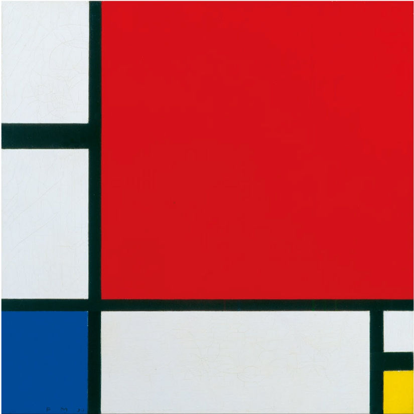
Piet Mondrian, Composition II in Red, Blue, and Yellow, 1930. Image courtesy of Google Arts & Culture. 

Applying the Constructive Criticism model

Description: The chosen artwork is a mixture of basic colours such as red, blue, yellow, white and black. The artwork was presented in tiles, in which the squared and rectangle tiles were coloured differently. On the upper right corner of the artwork, there is a huge red square which occupies 70% of the artwork. As compared to the red square, the blue and yellow shapes can only be seen at the bottom two corners. Interestingly, the white rectangles are

Analysis: At first glance, the artwork simply shows a mixture of different coloured squares and rectangles, with no symbolised meaning behind it. However, if we take a closer look, despite the random shapes and colours, the artwork evoke a sense of balance. The balance between colours and shapes gives us a sense that the relationship is mutually inclusive. The artwork does not make one feel uneasy but rather intriguing. On the top left side of the artwork, the single line appears to be thicker than the rest.

Interpretation: According to Piet Mondrian, he called this style of artwork as Neo-Plasticism. He believed his abstraction could serve as a universal pictorial language representing the dynamic, evolutionary forces that govern nature and human experience. The artwork may seem to be still, but with that single line, it brings life to the whole artwork. It also gives a harmonious feeling to the audience.

Judegement: At first glance, I do not understand the artwork as it does not symbolised anything. After understanding the history and the artist and reanalysing the artwork, I find it truly an amazing piece.

Design a site like this with WordPress.com
Get started